
Live Class
The all new experience
For
Classplus
Timeframe
September 2022,
2 Weeks
Role
Leading project with 2 Designers
Tool Used
Figma
Live Class
The all new Experience

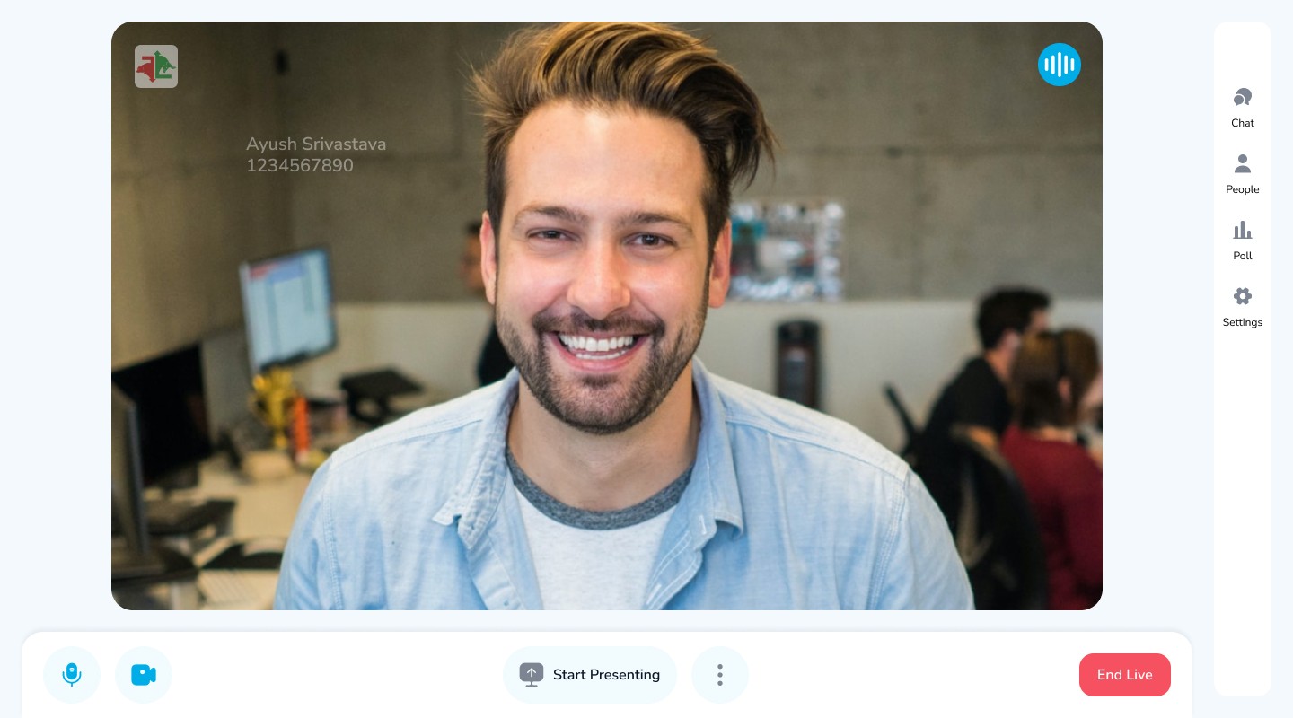
OVERVIEW
In the dynamic realm of online education, the Live Class feature on the Classplus platform has witnessed a remarkable surge in adoption and utility among tutors. Over the past years, diligent efforts have been invested in refining its functionality and technical infrastructure. However, the user interface (UI) and user experience of the Live Class feature has remained untouched for an extended period. In response to accumulating user feedback from both tutors and students, this UX case study delves into the strategic process of reimagining and revitalizing the Live Class UI.
Problem Statement
To stop our client from moving out of our platform due to sub standard of out Live class platform by enhancing its user experience through technology and design

01

2 Weeks
Project Duration

Component

500+
Screens

DESIGN PROCESS
As it was a project with tight timeline, we followed a Deep Dive Approach. First , we analysed our current platform and our competitors to understand what they were offering that we don't.We then brainstormed the ideas and build and initial Design and show cased the prototype to stakeholder and users.
02
Step 1 : Analysis
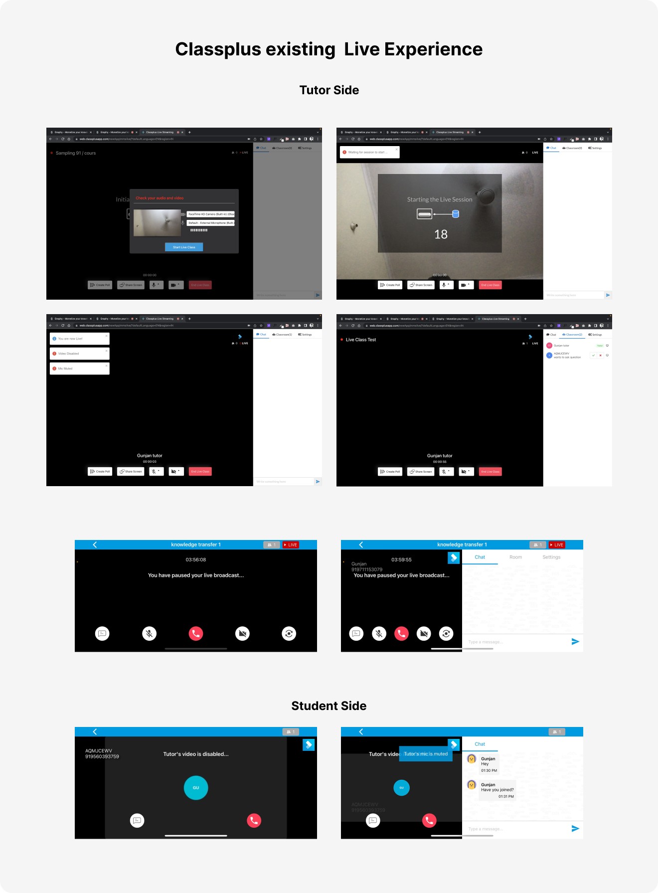
First , we analysed our current platform and our competitors to understand what they were offering that we are not.Few UX issues that we find and were concerning

First , we analysed our current platform and our competitors to understand what they were offering that we are not.Few UX issues that we find and were concerning
Tutor Side
Takes 30+ seconds to go live
Showing toasts for every single action. Becomes overwhelming.
Small window for camera preview before live class starts.
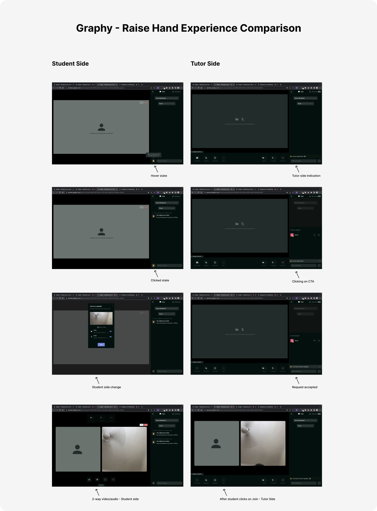
No indication of where to accept/reject handraise on tutor side except a toast
UI needs to be improved
Can’t share screen with video turned off
10+ sec audio/video lag between tutor and student
As a first time user, post ending the live session, there is no information when the live recording will be available.
Student Side
When tutor ends live class, student’s live class ends immediately without any message.
Needs a waiting room, if tutor hasn’t started the live class
Competitor Analysis
Our direct competitor were Teachmint ,AppX and Graphy so we did a quick compitetive analysis on Techmint and Graphy as APPX was verified B2B paid platform.
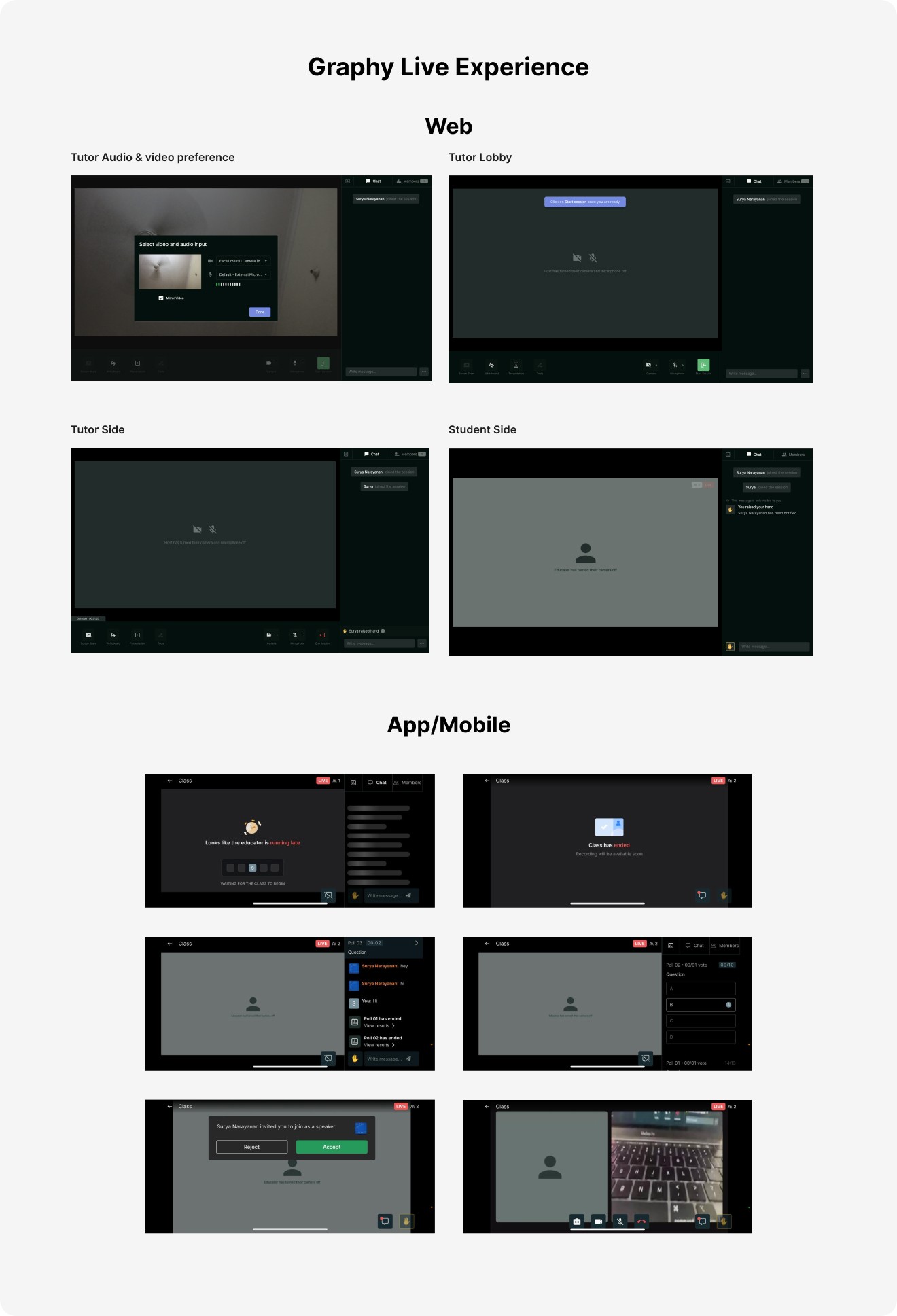
Graphy Live Class
PRO
No video/audio lag between educator and student
Clean Interface
Intuitive Handraise experience for both tutor and students
Every click has an instant response with no loading or lags.
Can fullscreen the video
Has two way video and audio like Google Meet on handraise
Has waiting room for students
Poll experience is better
CON
Tutor side go live have an pseudo state which is confusing
Can’t disable chat for specific students
Can’t pin chat
Chatting in portrait mode was difficult
Teachmint Live Class
PRO
No video/audio lag between educator and student
Poll experience is better
Recordings not available by default. Tutor has to click on record for those live classes he wants to save.
Every click has an instant response with no loading or lags.
Has two way video and audio like Google Meet
Can fullscreen the video
Has waiting room for students
Can go live instant in one click, no need to add any details.
CON
Can’t disable chat for specifc students
Can’t pin chat
Chatting in portrait mode was difficult
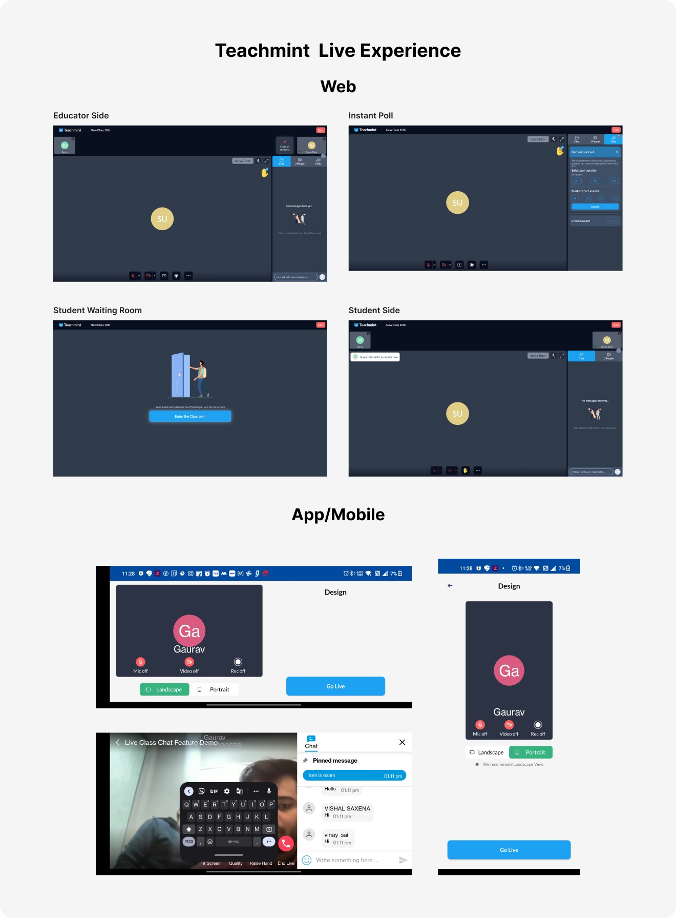
Benchmarking
We analysed major market player which support video streaming which our users were also using that were Google Meet, Zoom
Google Meet
Widely Used
User firendly , intuitive UI
Pre joining screen gives sense of security & satisfaction
Have whiteboarding option
Have Fluidic cross platform design

ZOOM
Widely Used
Adcanced options for video sessions
Join Audio screen is confusing
Have white boarding option
Can handle large audience

Step 2 : Understanding User behaviour
First , we analysed our current platform and our competitors to understand what they were offering that we are not.Few UX issues that we find and were concerning
User Persona

Varun Awasthi
Age
36
Job Title
Coaching Center Owner
Location
Ghaziabad
Varun Awasthi is the owner of ABC Coaching classes and is a proud partner of Classplus. Varun use their app powered by Classplus to teach theirs student through live class
Pain Points
Too much lag in live classes
Difficult to check handraise request while teaching
No screen sharing option while video is on
No white boarding option
Goal
To take live classes hassle free
Need
A complete live class solution in which he don’t need to use multiple platform for taking live class like OBS

Abhishek Tripathi
Age
36
Job Title
Student
Location
Patna
Abhishek Tripathi is student studing online from Varun sir for their whitelabeled App. Abhishek use their app powered by Classplus to take take live class by varun sir.
Pain Points
Lag in communicating with tutor in chat and polls
No full screen option which makes it difficult to learn from mobile devices
Communicating with tutor is frustating as sometimes handraise is not accepted
Goal
To focus on learning and takes notes from the class
Need
Better way to communicate with tutor
IDEATION
In the dynamic realm of online education, the Live Class feature on the Classplus platform has witnessed a remarkable surge in adoption and utility among tutors. Over the past years, diligent efforts have been invested in refining its functionality and technical infrastructure. However, the user interface (UI) and user experience of the Live Class feature has remained untouched for an extended period. In response to accumulating user feedback from both tutors and students, this UX case study delves into the strategic process of reimagining and revitalizing the Live Class UI.
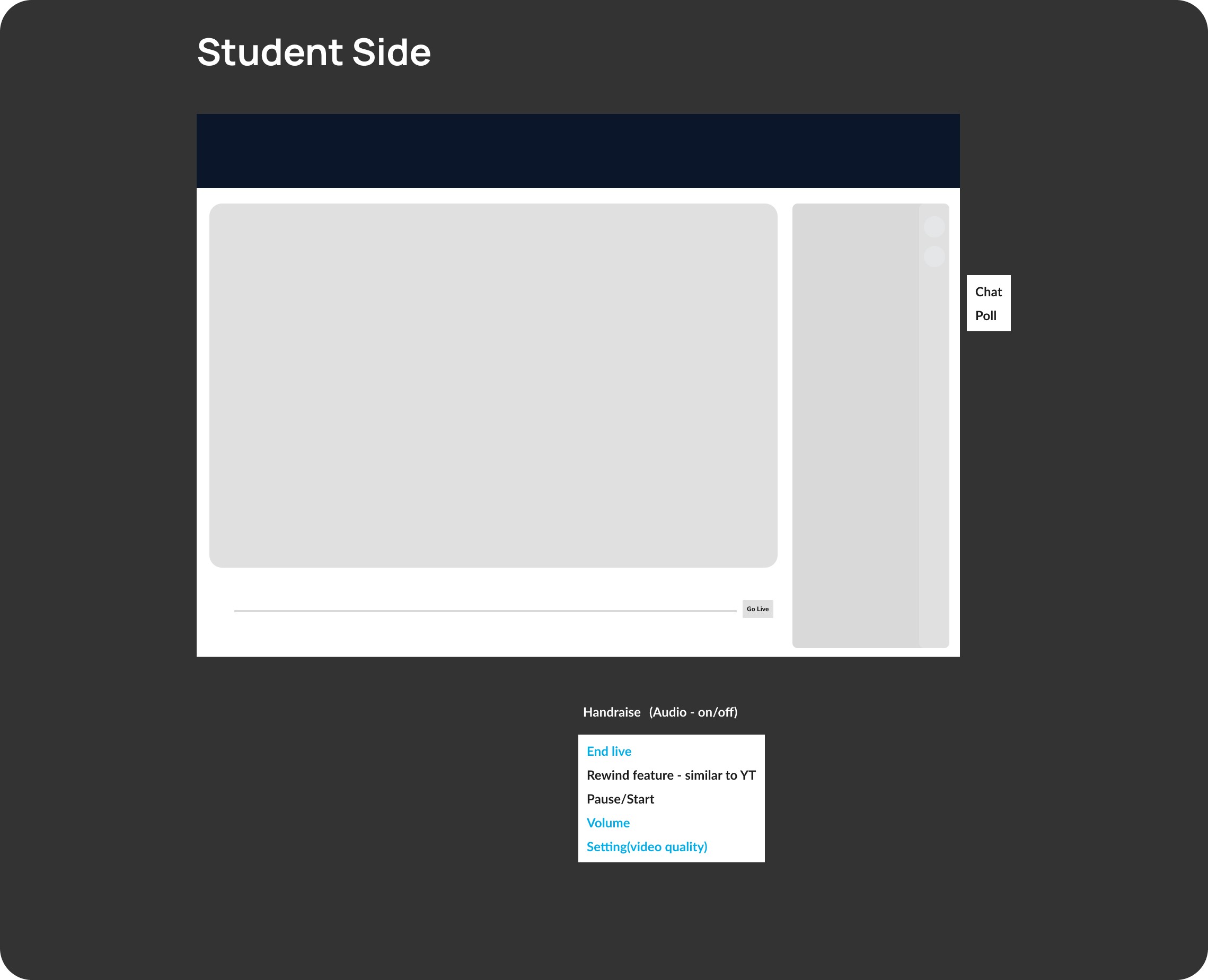
Wireframing- Low Fidelity

03
High Fidelity Designs
Tutor Side
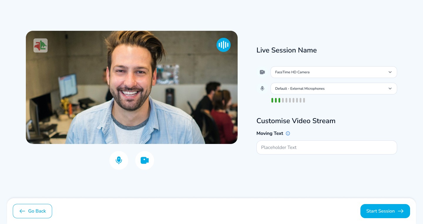
Tutor Lobby
When tutor clicks on Go Live, we will show a preview screen to setup their video and audio
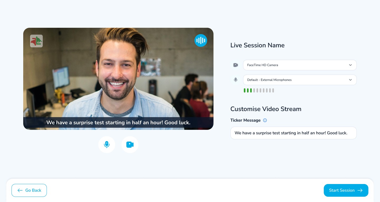
Ticker Option in Lobby
Tutor can add a custom text to generate lead or promotion
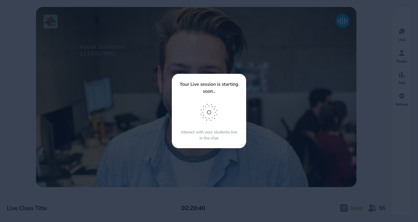
Joining Loader
To accommodate joining lag of almost 10 seconds, a indefinite time loader is given with some tips and tricks so that tutor lost track of loading time
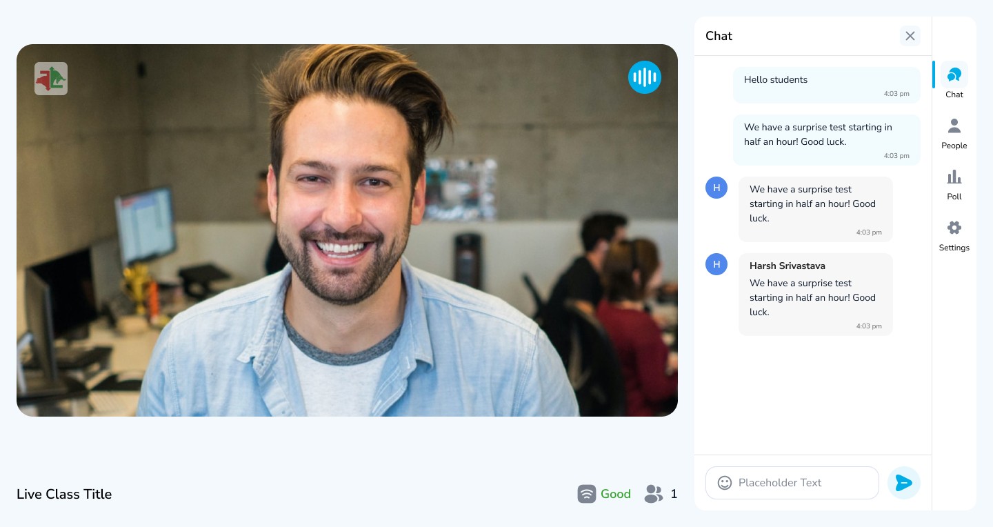
Chat
The All new chat feature now support chat pinning, chat reply, private chat and blocking users form chat
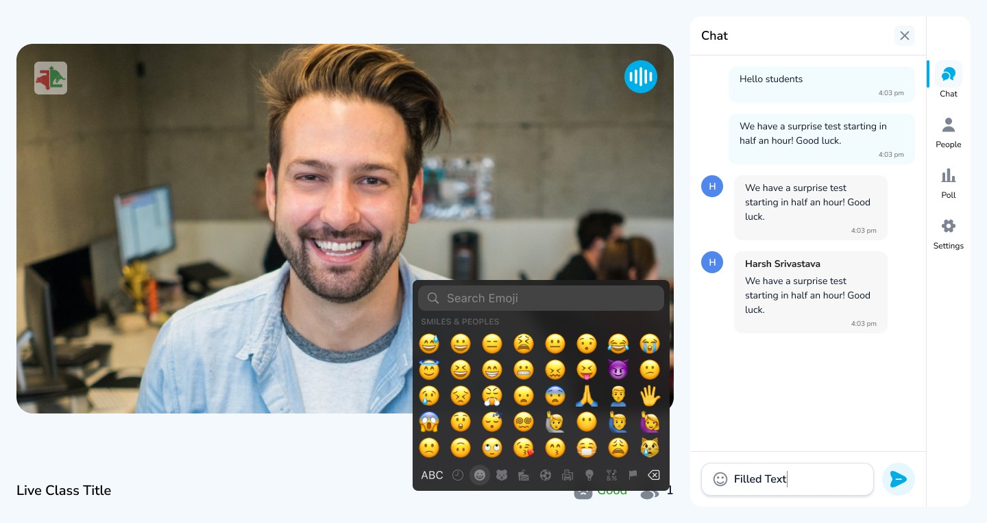
Emoji Support in Chat
Users can now reply quickly with the use of emojis
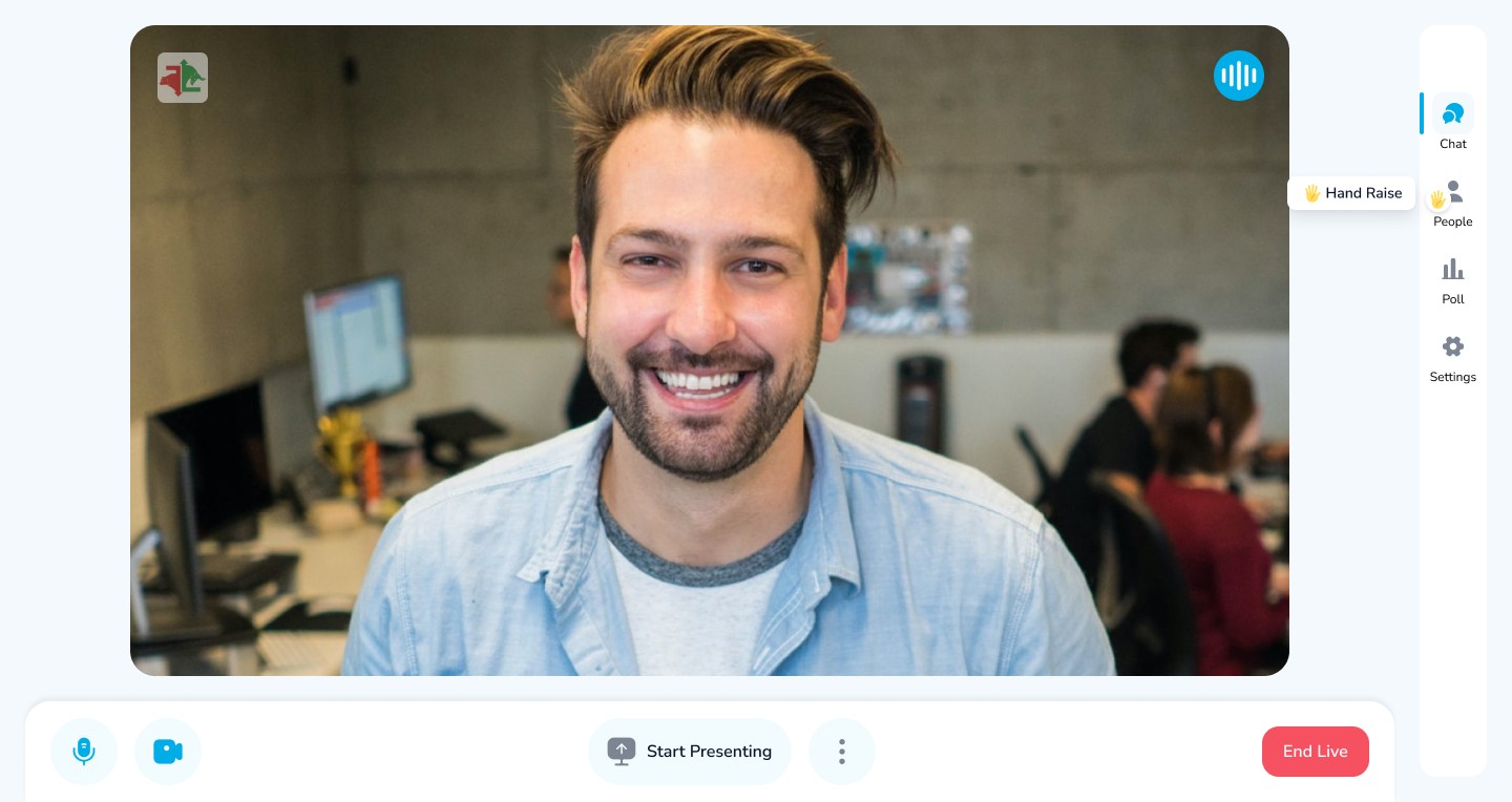
Intuitive Handraise
Handraise is now more intuitive for both tutor and students
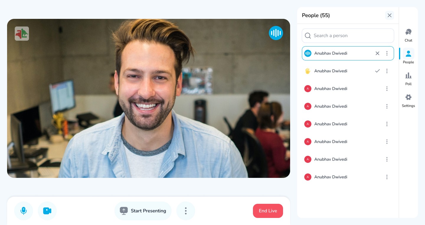
People Tab
Chatroom is now people tab, where all attendees and host are visible with control like block a user or accept a handraise directly from here
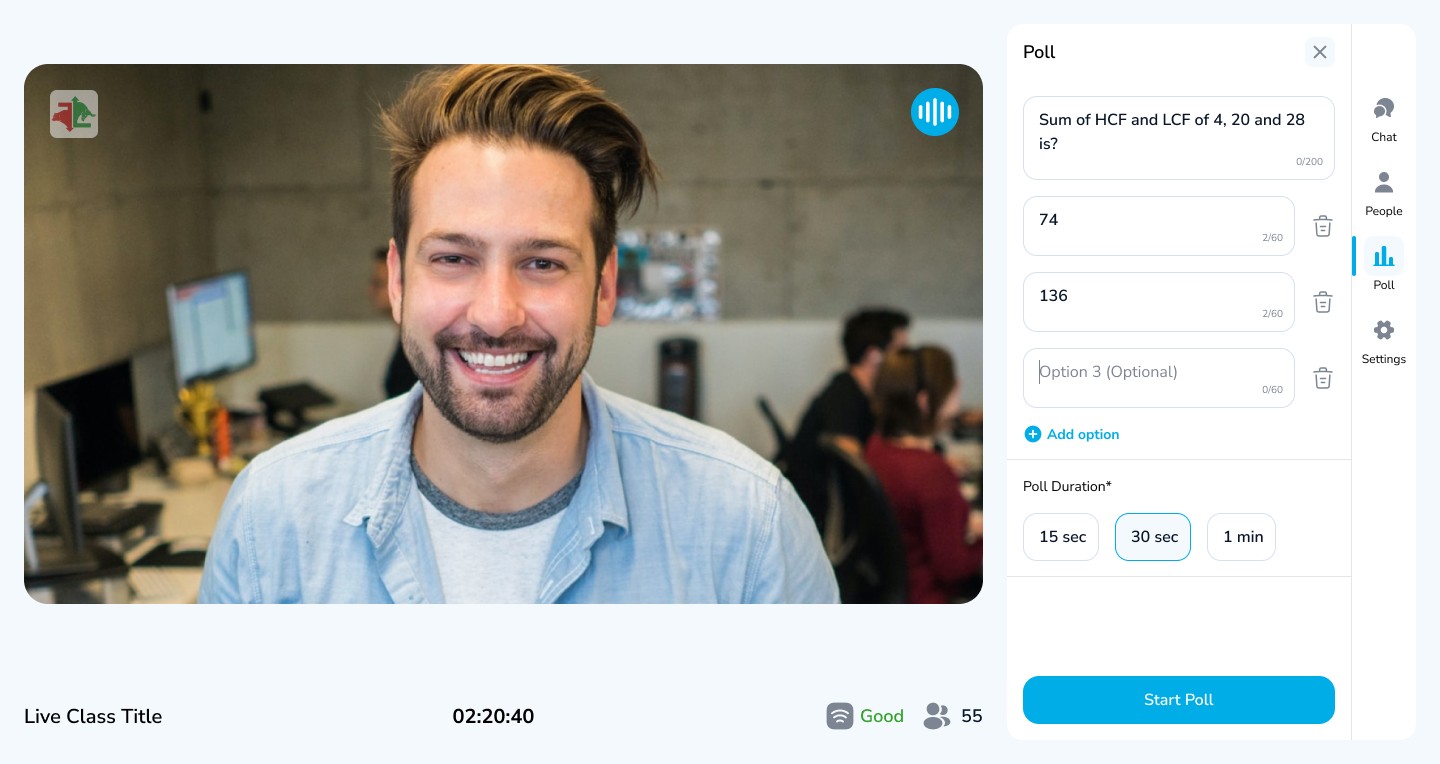
Polls
Tutor can now create and share poll with students and they can now answer in real time
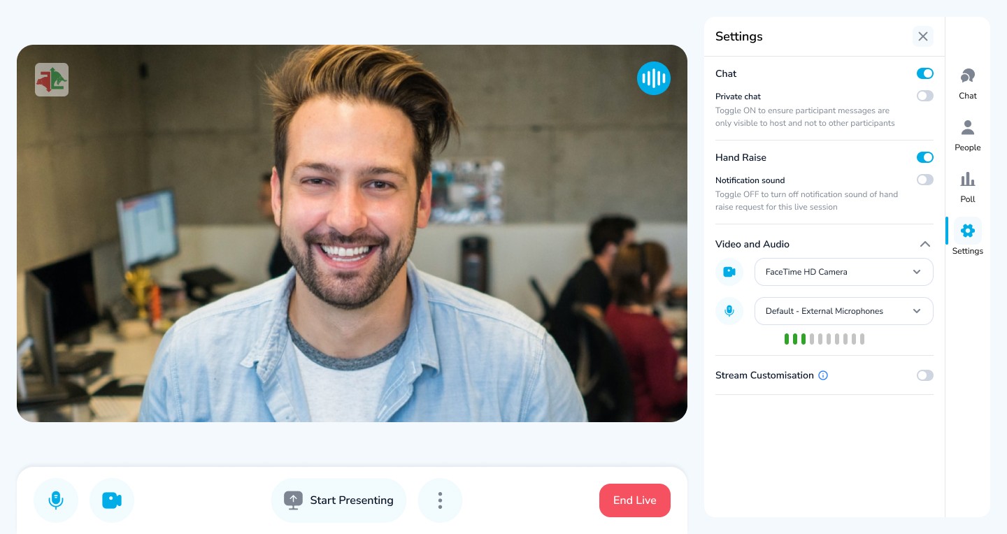
Settings
Chatroom is now people tab, where all attendees and host are visible with control like block a user or accept a handraise directly from here

Screen Present
Tutor can now present their screen while video is on
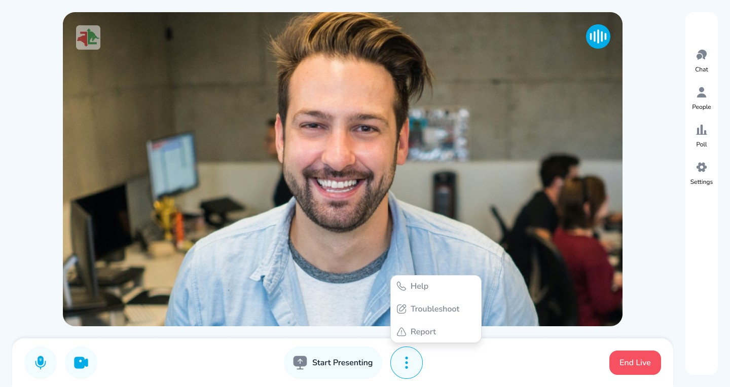
Advanced Options
Advanced options can be accessed through 3 dot menu
04
High Fidelity Designs
Student Side
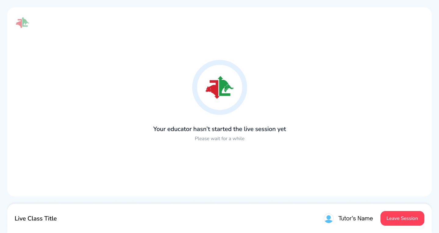
Student Lobby
When Student joins the live class but tutor has not joined yet

Preview Mode
When there is no action on screen then now action bar is visible and title and class info is visible instead

Seekbar
New Seek bar is introduced by which student can go back in time to view video if missed.

Handraise mode
When Handraise is accepted then seek bar will be hidden as student will be interacting with the tutor in real time. student mic controls will be activated to interact with the tutor through voice
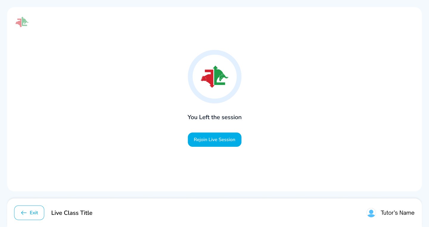
End Room
If a student leave a class, then he can rejoin class until the tutor has ended the class
3:19
59%

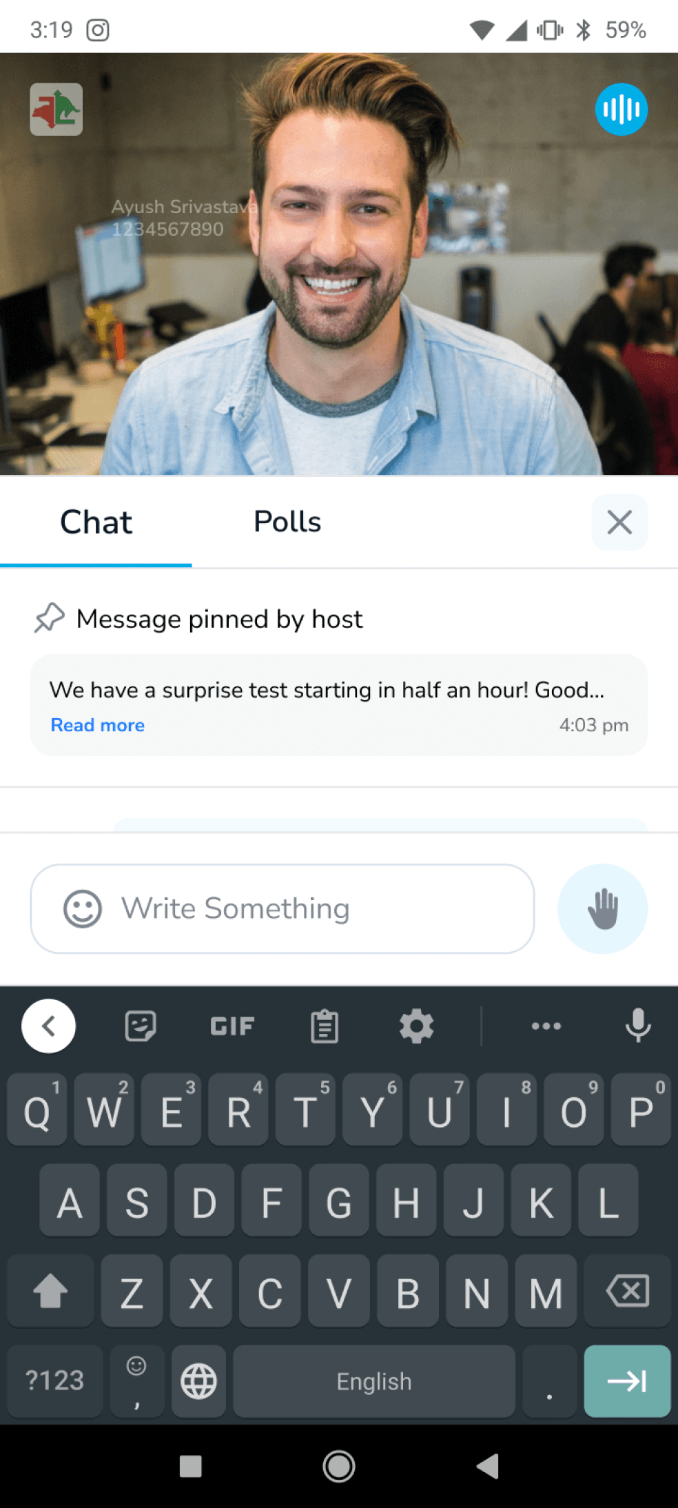
Portrait Mode
Now Student can interact with tutor and other student while not losing context through portrait mode in chats
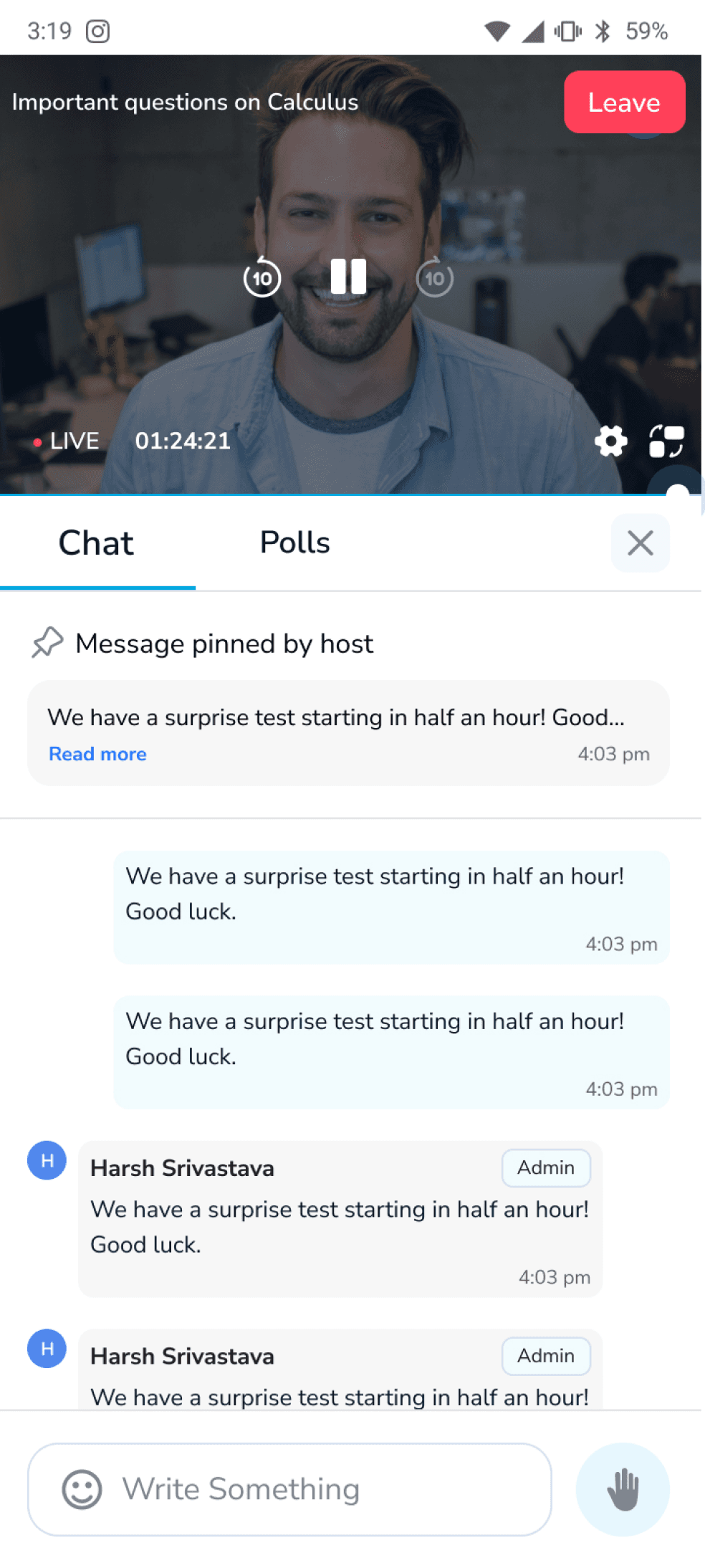
Portrait Mode -Tap
Student can control all the major functions in portrait mode also
3:19
59%



Mobile
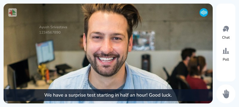
Now Student can learn from tutor effortlessly due to minimal design which gives maximum visibility of content
Mobile- Controls
Student now gets web like flexibility and controls on mobile as well


Showreel


Impact & Outcome
Lets talk about the impact it created
The new live class experience help in not only just retaining our customers,
but also in increasing our customer base by onboarding new ones.
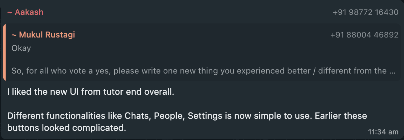
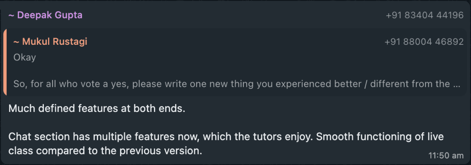
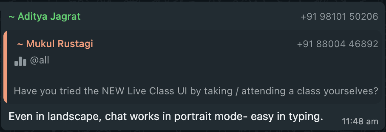
We run a review of new live class and it had an NPS score of 82
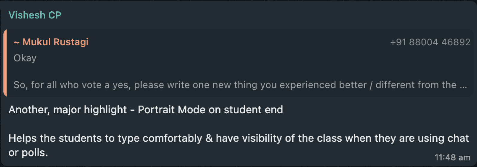
Below are the internal feedback shared by users.








Thank You
Gaurav Borra
Product Designer

Next Project
Classplus Journey
Back to work